Jenny Frison on Creating the Epic Cover Art for the Somna Cover Gallery & Spectregraph

A cover artist luminary, Jenny Frison produces images that speak volumes, with a stunning technique that blends elegance and mystery. She suspends moments that deftly summarize pages of story, expressed in bold compositions and expressive details. Unsurprisingly, her skills have posited her as one of the most sought-after and collectible artists in comics.

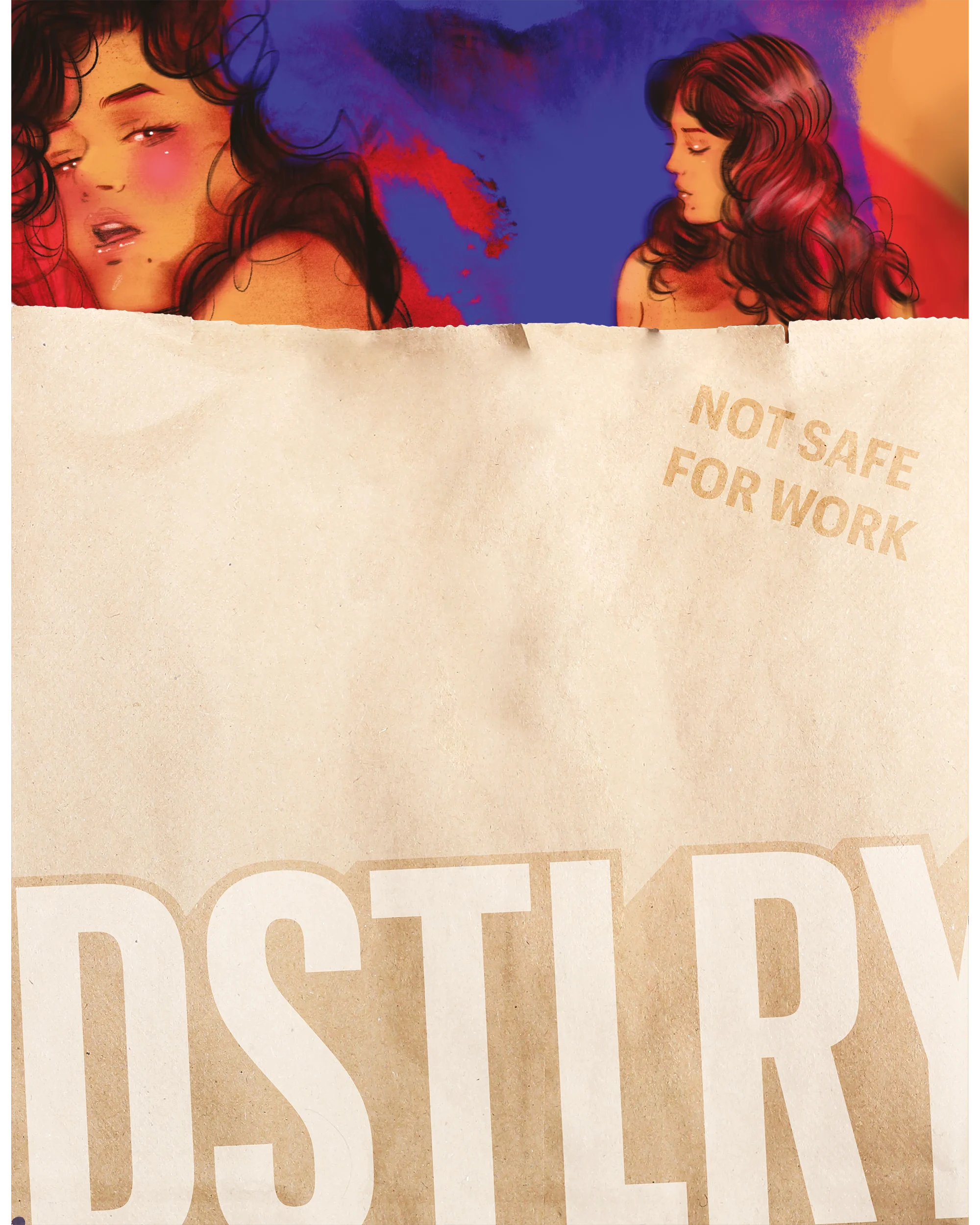
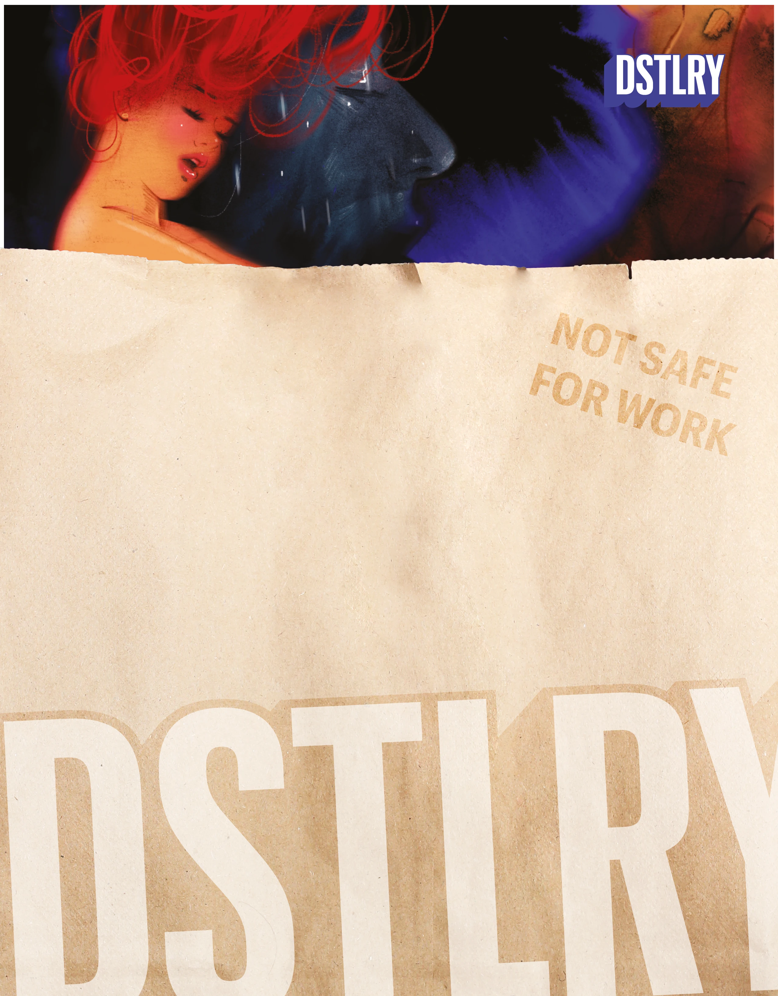
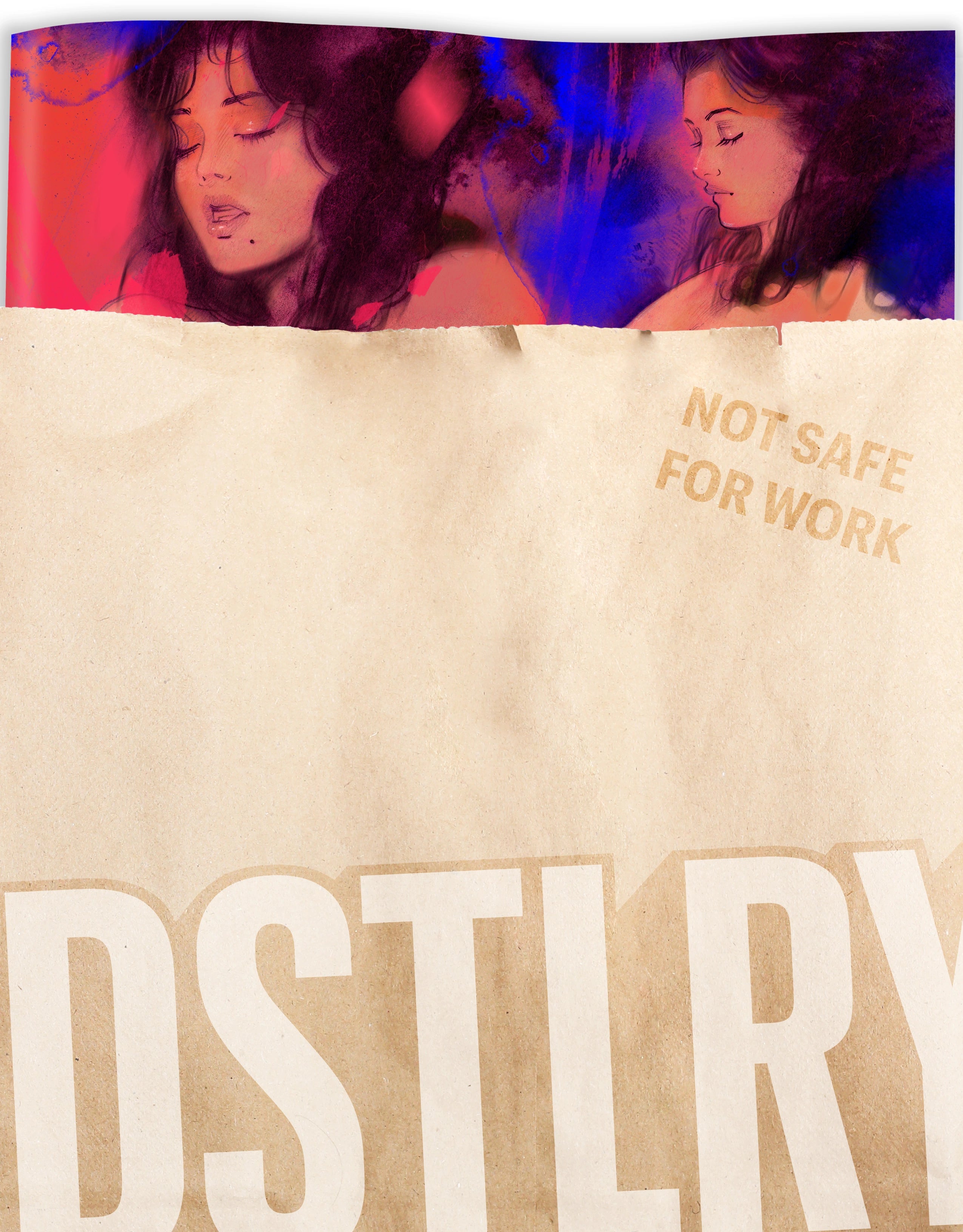
Frison’s art has become instantly recognizable on store shelves, but that recognition comes from years of craft in such titles as Revival, Wonder Woman, Buffy the Vampire Slayer, and more. At DSTLRY, she’s contributed variant covers for Spectregraph and Somna, as well as a new colorway for the Somna Cover Gallery collection—out today and featuring other spotlight artists as Julian Totino Tedesco, E.M. Carroll, Emma Rios, and (of course) series creators and Eisner winners Becky Cloonan & Tula Lotay.
Jenny answered some questions courtesy on craft and composition in the Q&A below, courtesy John Parkin.
You’ve been able to carve out a unique place for yourself in comics, working strictly as a cover artist. Did you ever consider drawing sequential art, or did you always know you just wanted to focus on covers?
Jenny Frison: I think I always knew I wanted to focus on covers. I graduated college with a specialization in illustration and focused my studies there on book cover illustration. After college I went to the Kubert School for a few years because I wanted so badly to work in the comic book industry. When I was there, everybody worked on the same assignments and the focus was sequential art. At the Kubert School I really discovered that sequential storytelling wasn’t for me. I always assumed I would have to work my way into cover art by way of sequential art, but I was incredibly lucky in that I was able to forge a career straight to cover work.
Talking philosophically, what makes for a good cover? When you shop for comics, what draws you to a particular image?
Frison: I guess it depends. The entire job of a cover artist is to make an image that is compelling enough that someone picks up the book. It’s tricky with comics because there are so many new comics each week and, in stores, they are all displayed with their covers showing. Then, in addition to making the cover compelling, you also have to make it stand out from all the many compelling covers around it. At some point in my career I just started focusing on creating the sort of covers that I respond to most: moody, evocative, character-driven portraits.
Although you’ve drawn covers for comics in a variety of different genres, I’m betting many fans identify your work with supernatural or horror-themed titles — images from Revival and Buffy usually pop into my head when I hear your name. There’s a gothic feel to your work, if that’s the right word, or maybe “elegant horror” is a better description. Was that by happenstance, or do you tend to be drawn to those sorts of projects?
Frison: Horror is absolutely my genre of choice. I love the juxtaposition of gross and beautiful that horror allows. I find beauty and disgust equally compelling and adding blood to a drawing is always fun!

In Process Inks for Jenny Frison's Cover to Somna #3
That brings me to the DSTLRY books you’ve done covers for, both of which fall into that area. What about Spectregraph and Somna drew you in and made you say, “Oh yeah, I want to draw something for them”?
Frison: Ultimately, I was chomping at the bit for both those books because I adore their creative teams. Becky Cloonan and Tula Lotay are two of my all-time favorite artists. I was lucky enough to get a sneak peek of some of the art for Somna at a convention when I was tabling next to Tula and I was immediately equal parts jealous of what they had created and desperate to contribute. Every part of that witchy erotic horror vibe spoke to me on a deep and personal level.
James Tynion IV and I have been friends for years. Whenever I read a story of James' I feel a connection that I don't find often in storytelling. His work is so character-driven and deeply emotional, it feels like a perfect fit for me. Also, I'm grateful for every chance I have to work with James because I feel like he understands me as an artist and what my body of work represents, so it's always a fun collaboration.
And I adore Christian Ward's work. It's so textural and graphic and provocative. I knew from the jump that Spectregraph would be a success.

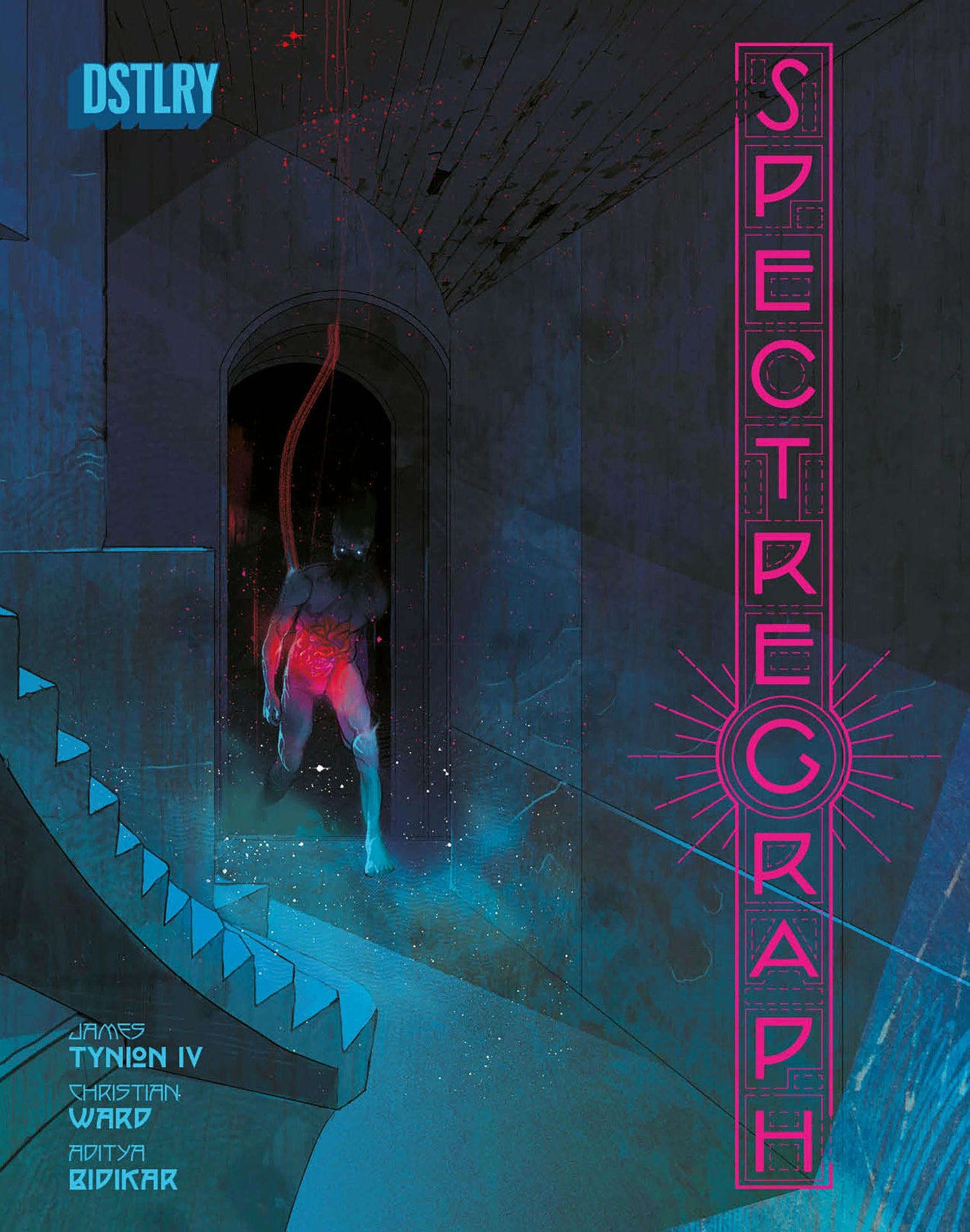
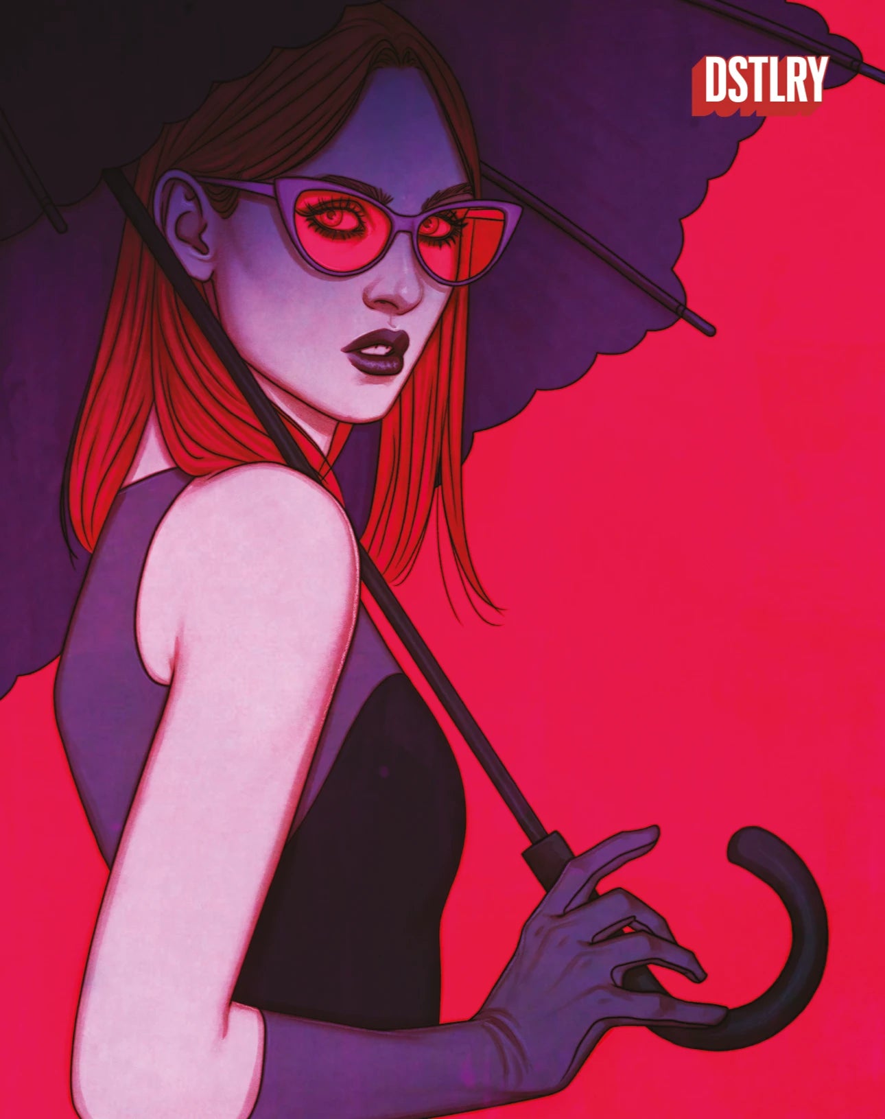
Jenny Frison's Cover to Spectregraph #1
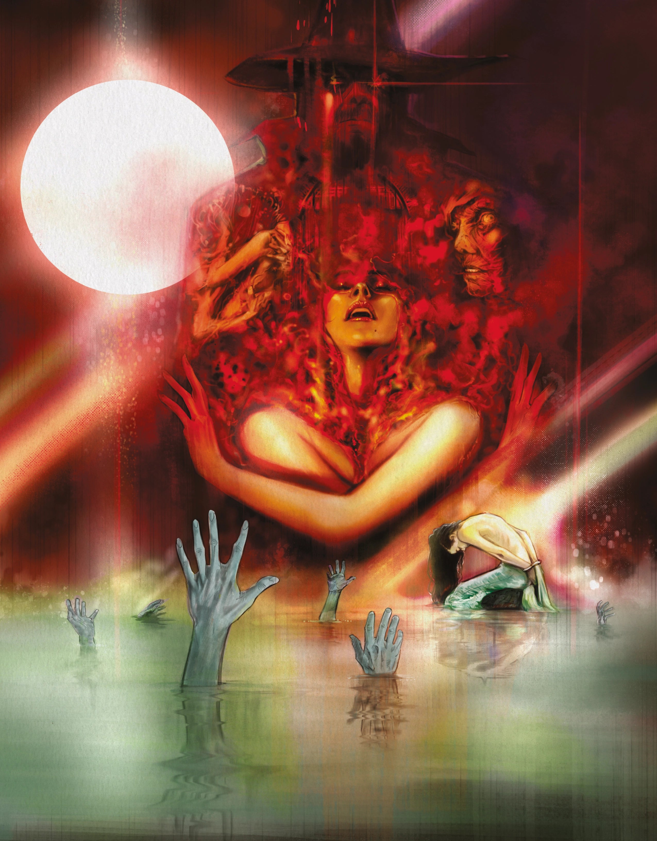
For Spectregraph, you did a portrait of Vesper that is both beautiful yet foreboding. What were you hoping to capture about her in your image?
Editor extraordinaire, Eric Harburn, sent me a perfect description of Vesper that was so vivid. He described her as having an "obsession with the aesthetics of death" among other literal descriptors. That, paired with Christian's character design, I knew I wanted this cover to portray Vesper's haunting stare peering through her shocking red glasses and an aggressively graphic red background to pop out from behind the purple element of her sun parasol. Then, I included the unseen glitching ghost hand on the back cover reaching for her to hint at the horrors to come.

In Process Inks for Jenny Frison's Cover to Spectregraph #1
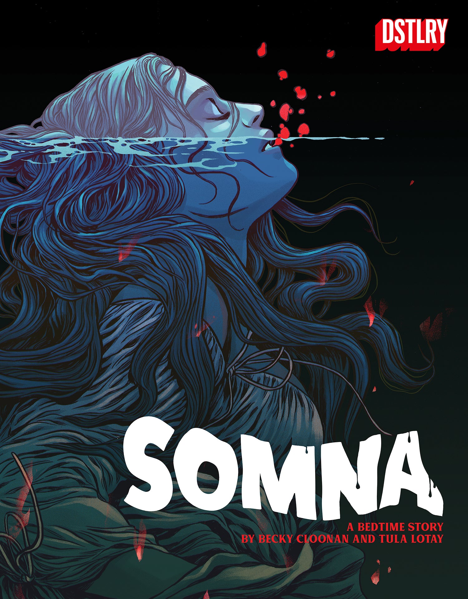
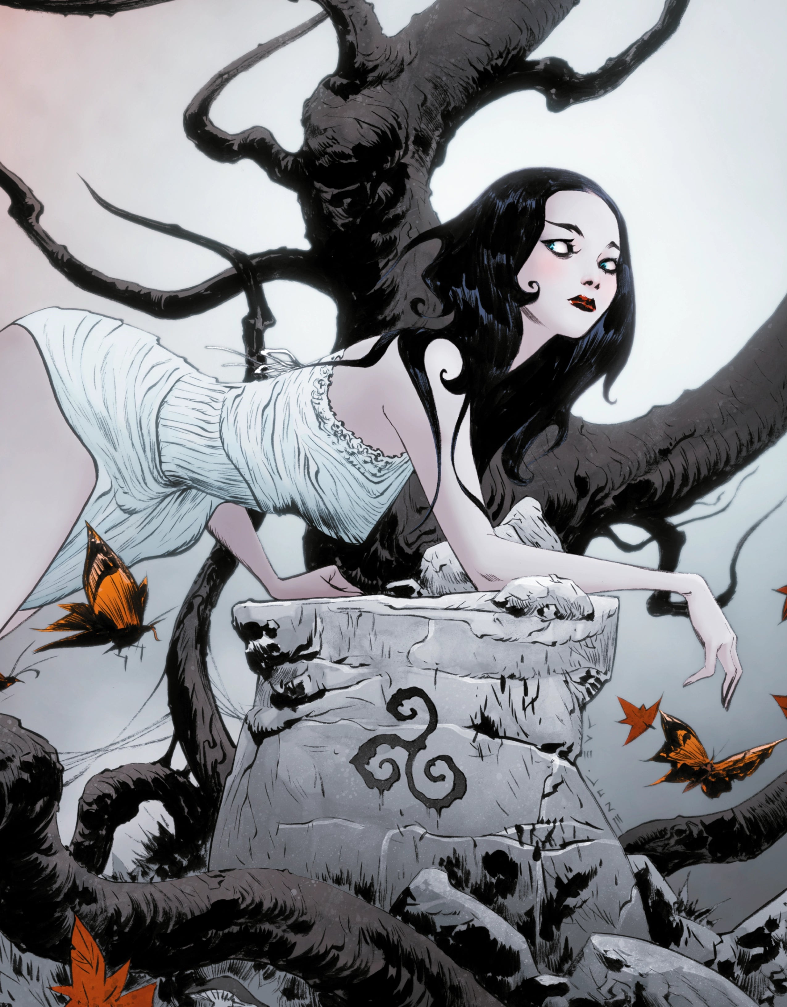
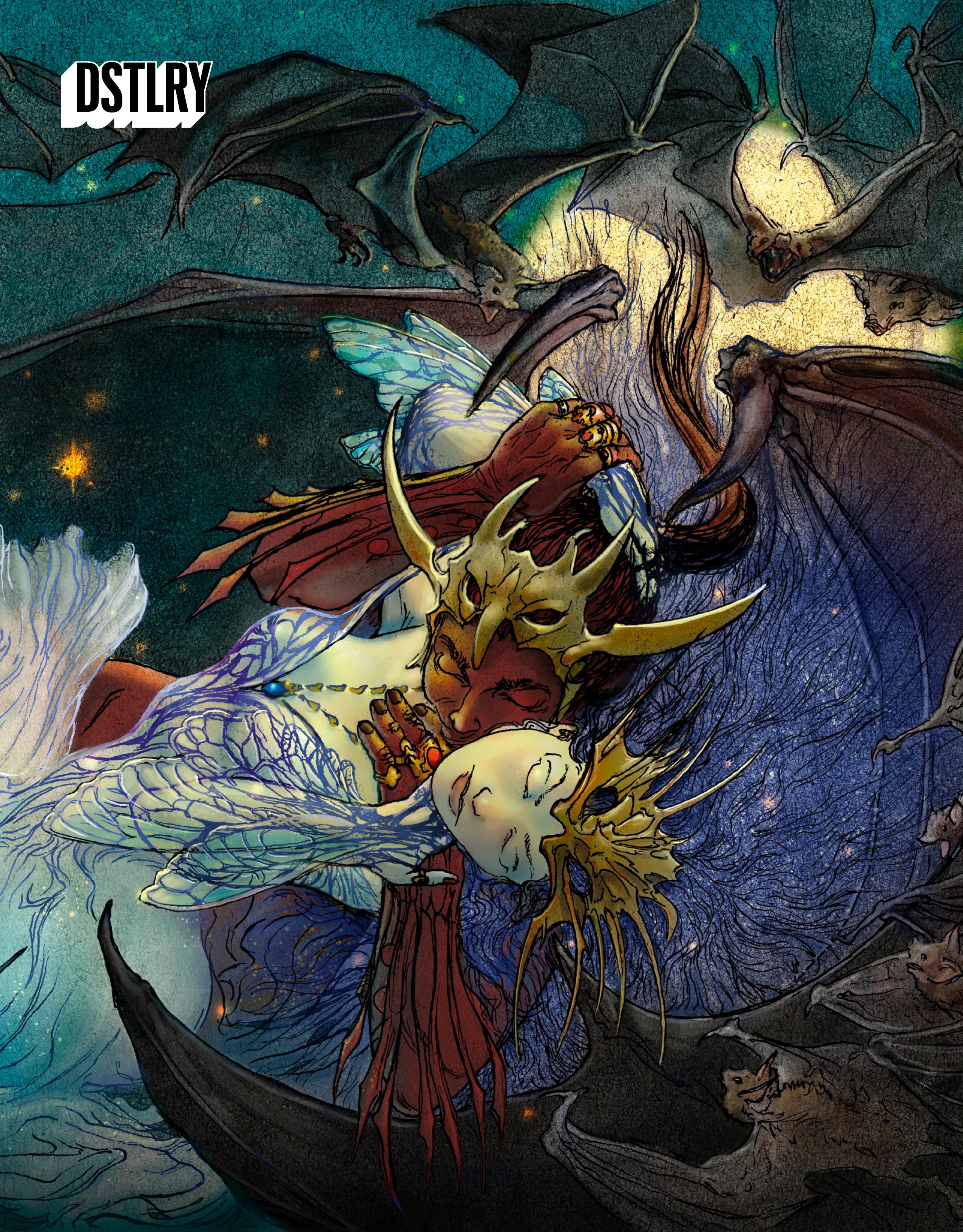
Your cover for Somna has a more visceral, passionate feel to it—what were you hoping to convey with it?
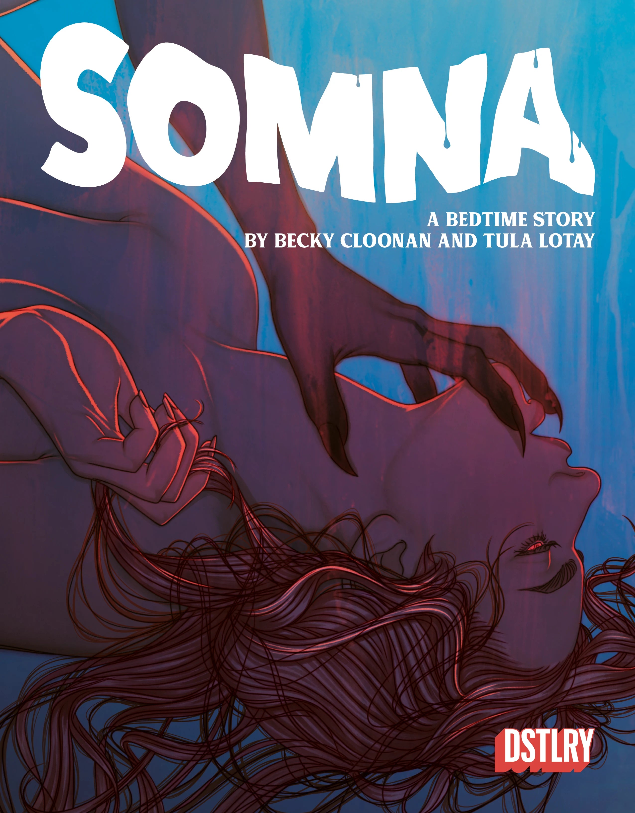
For Somna, I knew I wanted the image to evoke a dreamy, desperate sexuality. Ingrid, giving completely of herself, even if she believes she shouldn't. The hand, it's owner unseen, representing erotic dark temptation.

Jenny Frison's Cover for Somna #3
Now for the Somna Cover Gallery cover, which is the same image, you took a different approach with the colors—and it really changes the feel of the image. Can you talk about your color choices for both the original image and the Cover Gallery?
I tried a few different options with the colors for the gallery. The colors for the original cover are already so simple...warm colors on Ingrid to pop from the cool background. As if a literal heat is coming off of her. Ultimately, what made the most sense to make the Gallery image unique from the regular cover was to flip the warm and cool. So the "heat" comes from all around Ingrid.

The Somna Cover Gallery, with a new colorway by Jenny Frison
With both these covers, you were drawing characters who aren’t as well known as some of the other subjects you’ve drawn, like a Wonder Woman or Red Sonja. Does that change how you approach a cover? And how much did you know about these comics before you were asked to draw covers for them?
It definitely changes my approach. For established characters, especially since my variant covers aren't "story specific", the intention is to create an iconic image. For creator owned work with newer characters, I can focus more on the emotion of the story and the mood of the character. Both are fun assignments, but different.
For Somna, I got to read the entire first issue before creating my cover as well as see a few of the amazing covers they already had commissioned.
For Spectregraph, if I recall, I had the description of the story and Vesper and the fantastic character designs of the main characters as well as a few unlettered pages.
Finally, are there any other DSTLRY books or characters you’d love to get the chance to draw a cover for?
I love the work that DSTLRY is putting out. I would be asking to create covers of EVERY book if my schedule wasn't always so packed. I'm sure there will be more to come!