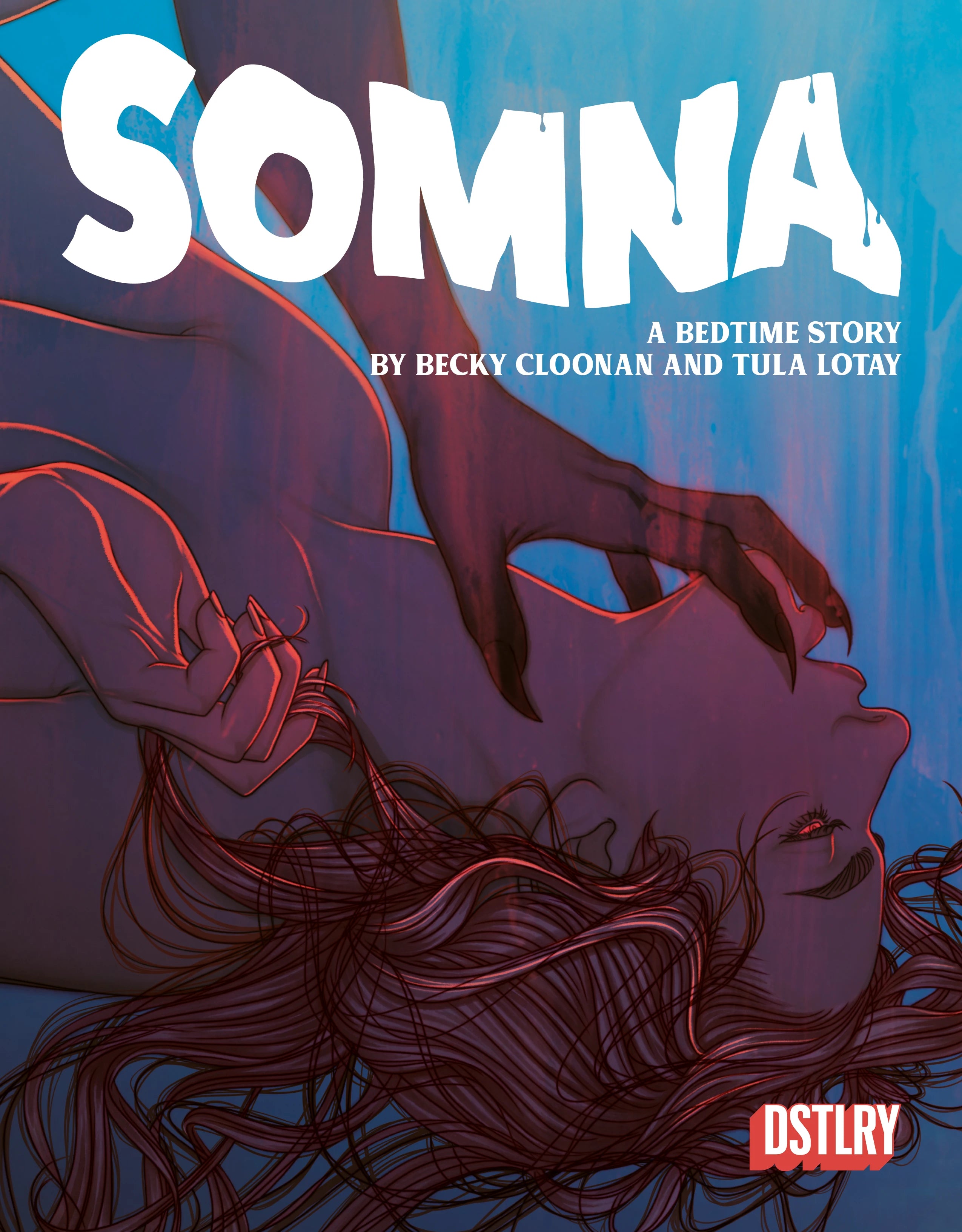
Lee Loughridge on Coloring the Cosmos in Gone, Somna & Beyond

Nominated for a 2024 Eisner Award for Best Colorist, Lee Loughridge and his striking palettes have consistently entranced readers for decades. The full spectrum of those skills were witnessed this year as he colored DSTLRY's first two series: the sci-epic Gone both written and drawn by Jock, and Somna, coloring the portions illustrated by co-creator Becky Cloonan. Loughridge expertly shifted from forest greens and stark browns of a coastal 1700s British town to the hallucinogenic expanse of space between the projects.
With the hardcover of Gone launching today—both in standard editions as well as in preorder for the Deluxe edition launching in October, Lee answered some questions from Sam Stone in the Q&A below.
Lee, you've been working with Somna co-creator Becky Cloonan for a long time now. How has your working relationship grown and evolved over the years?
By now I basically know what she is looking for. Oftentimes I try to take it a step further, palette-wise, just to mess with Becky.
How was working on Somna with Becky unique compared to your past collaborations?
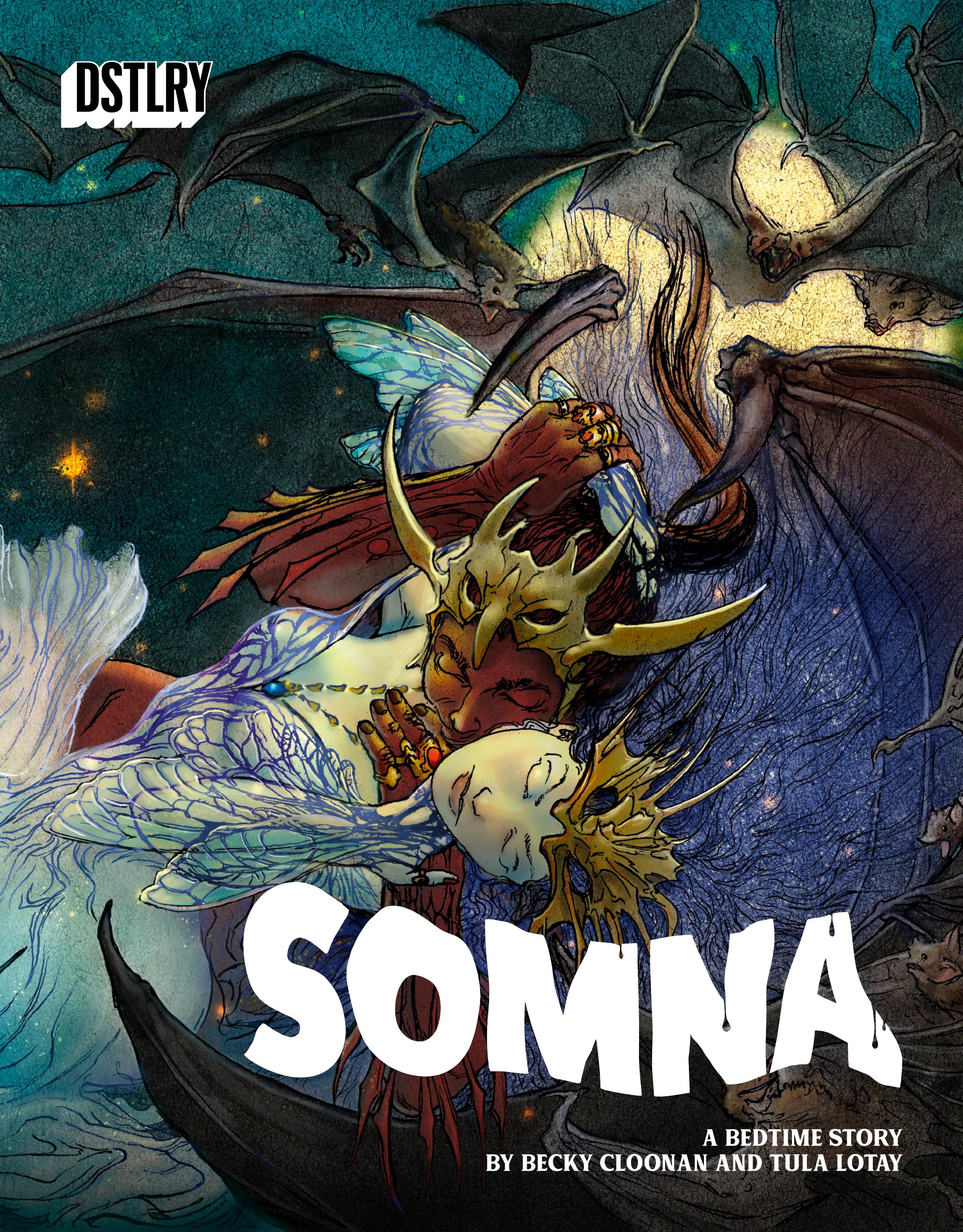
It was interesting having two different art teams. I was curious how Becky and Tula would fuse the styles when necessary. They blew me away.

Will Dennis, Becky Cloonan, Tula Lotay & Lee Loughridge accepting the Eisner for Best New Series for their work on Somna
Sensuality is such an important part of the story of Somna. How did you want to accentuate that?
I often use color to define an emotion so I used the hell out of that muscle on Somna.
Similar to Becky, you've known Jock for years. How has it been working with him at DSTLRY?
It’s been amazing. DSTLRY is great about letting the teams just do their thing. Jock and I have worked together for a few decades now, I have a pretty good idea of what he wants.

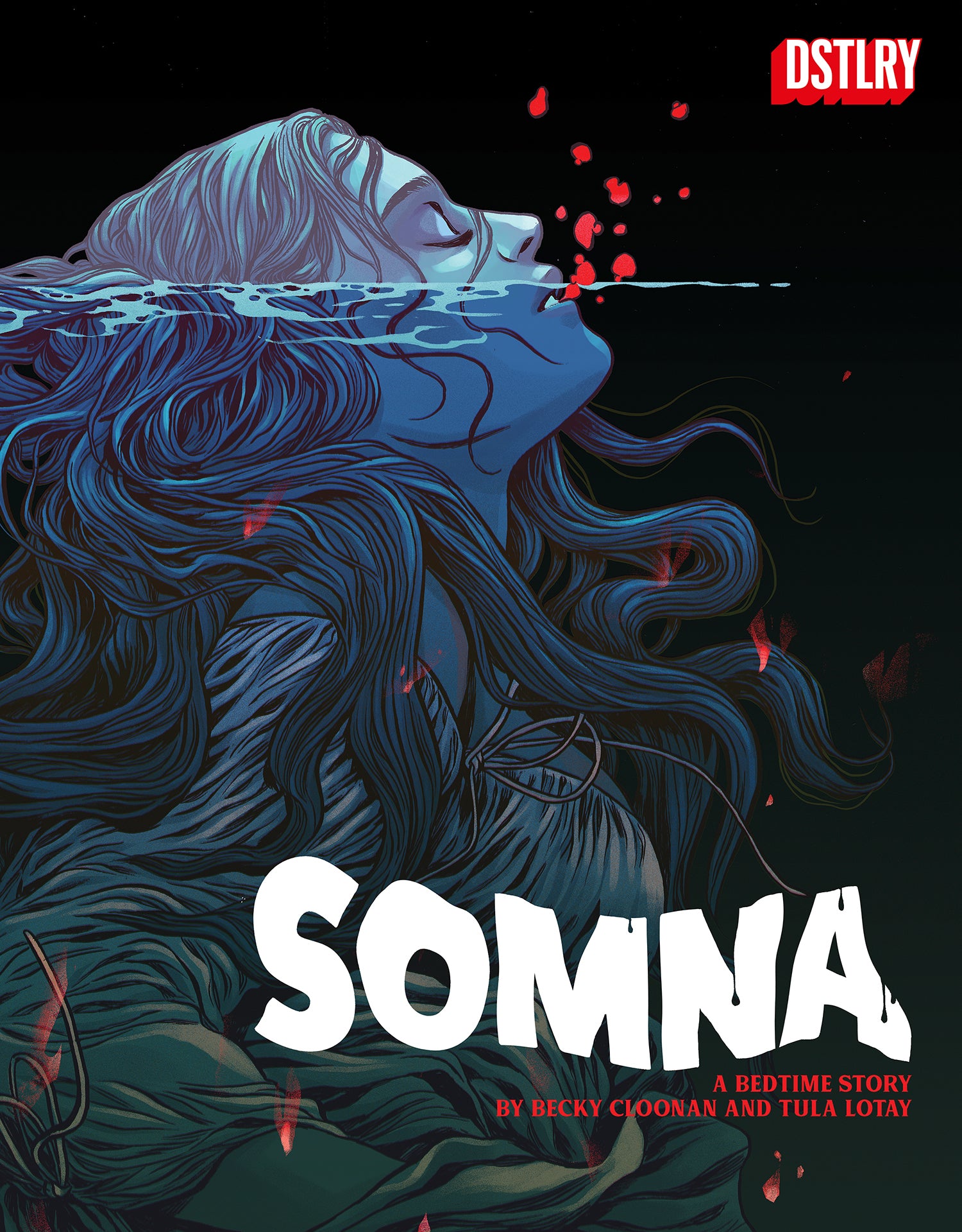
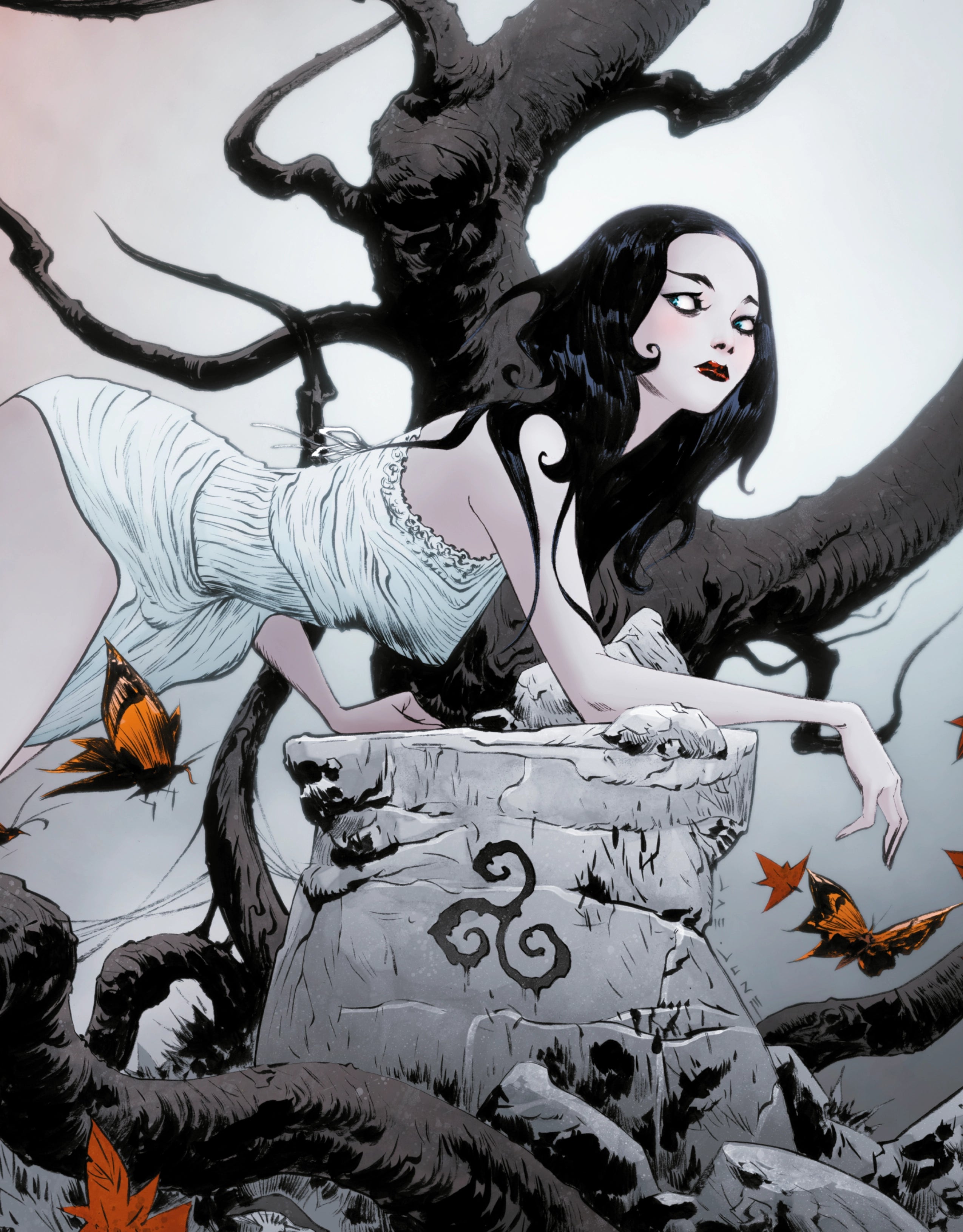
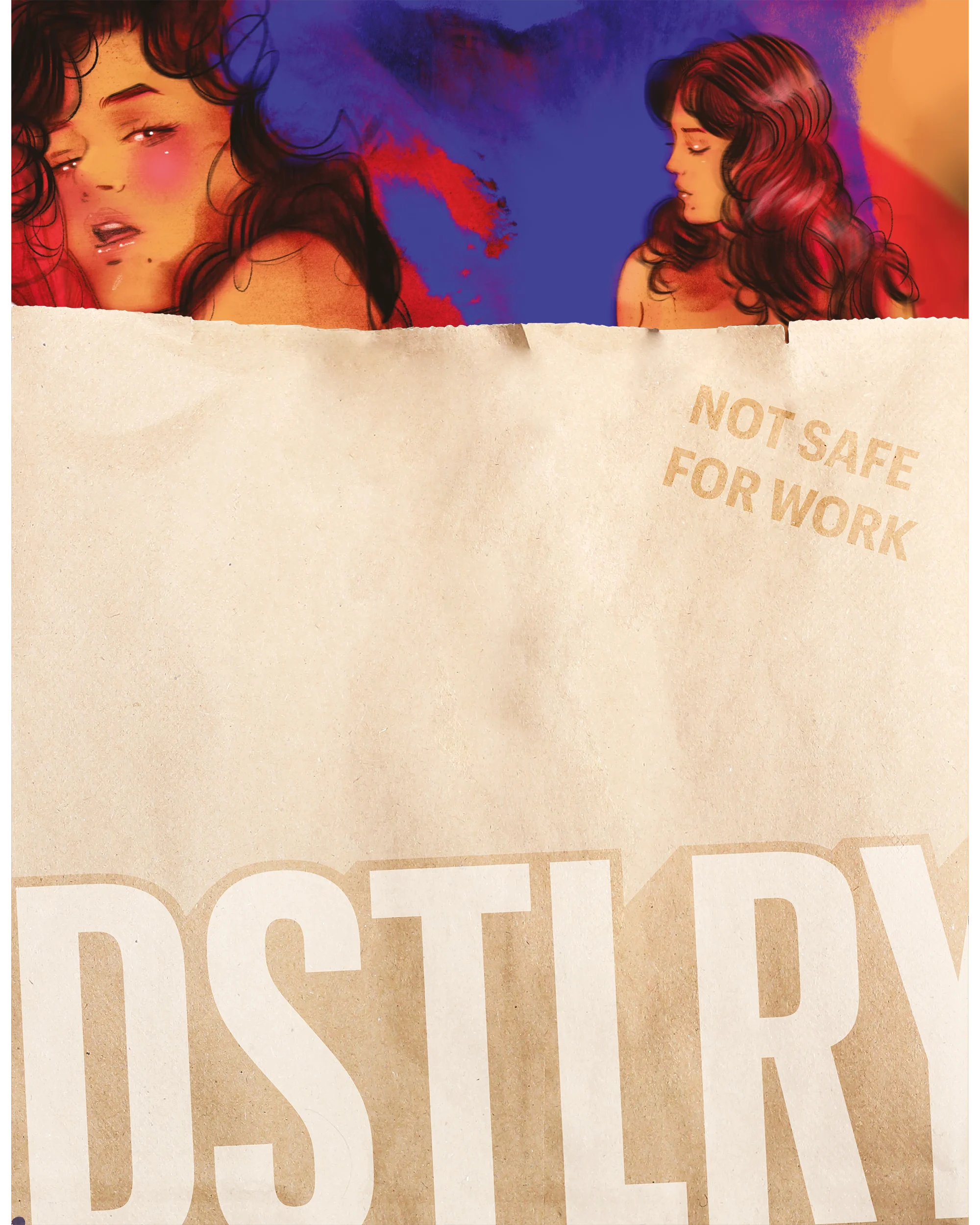
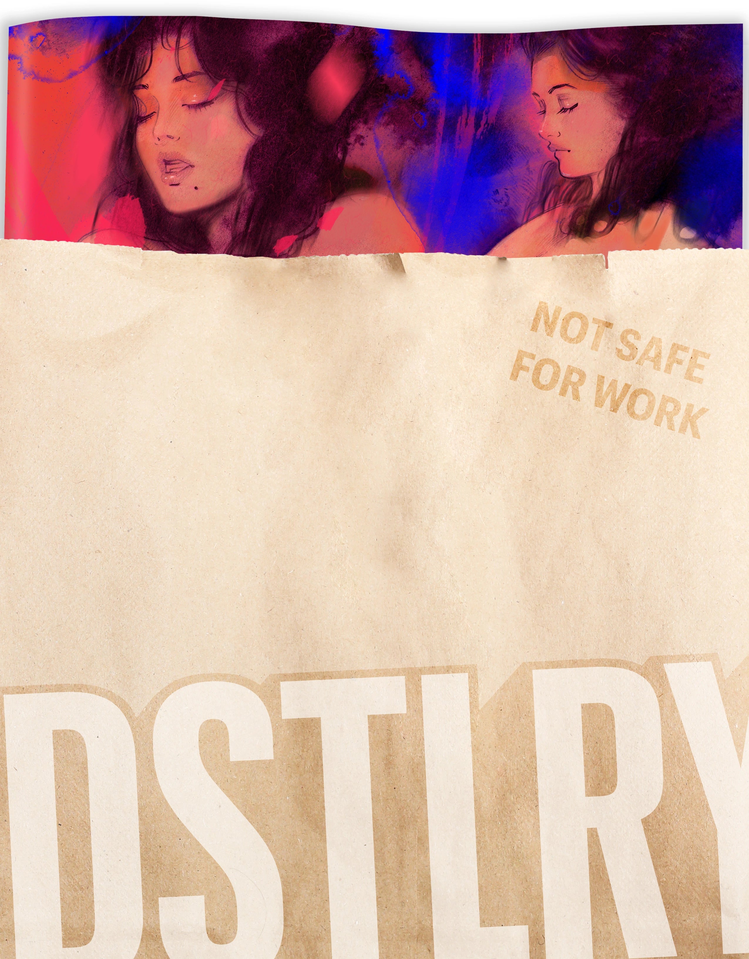
Somna interior art by Becky Cloonan & Lee Loughridge
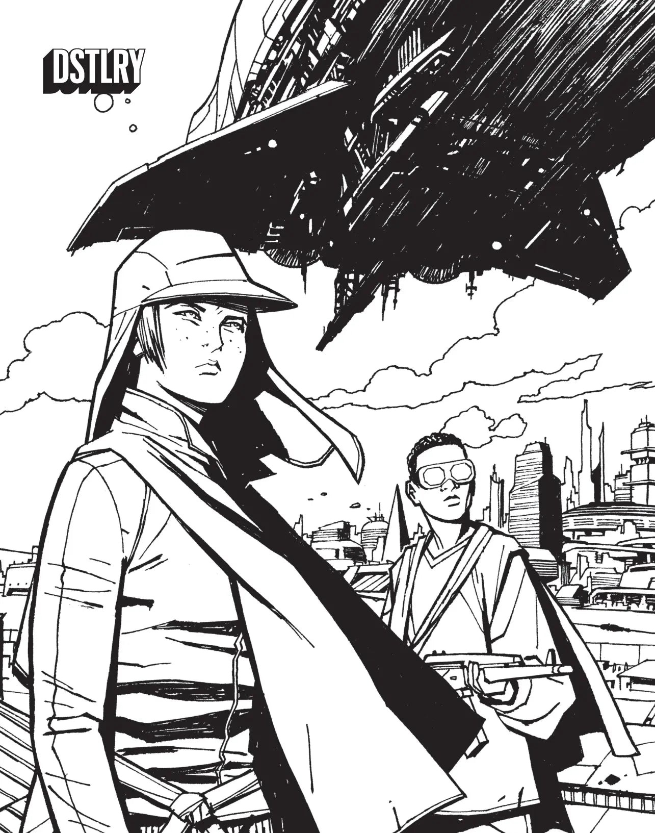
There's a stark color contrast between the interiors and exteriors in Gone. How did you want to distinguish them?
Jock set things up initially, I just ran with it.
When it's a project like Gone, with Jock also initially providing colors, how did you merge his palette with your own?
Our tastes are pretty much identical, so that was super organic.

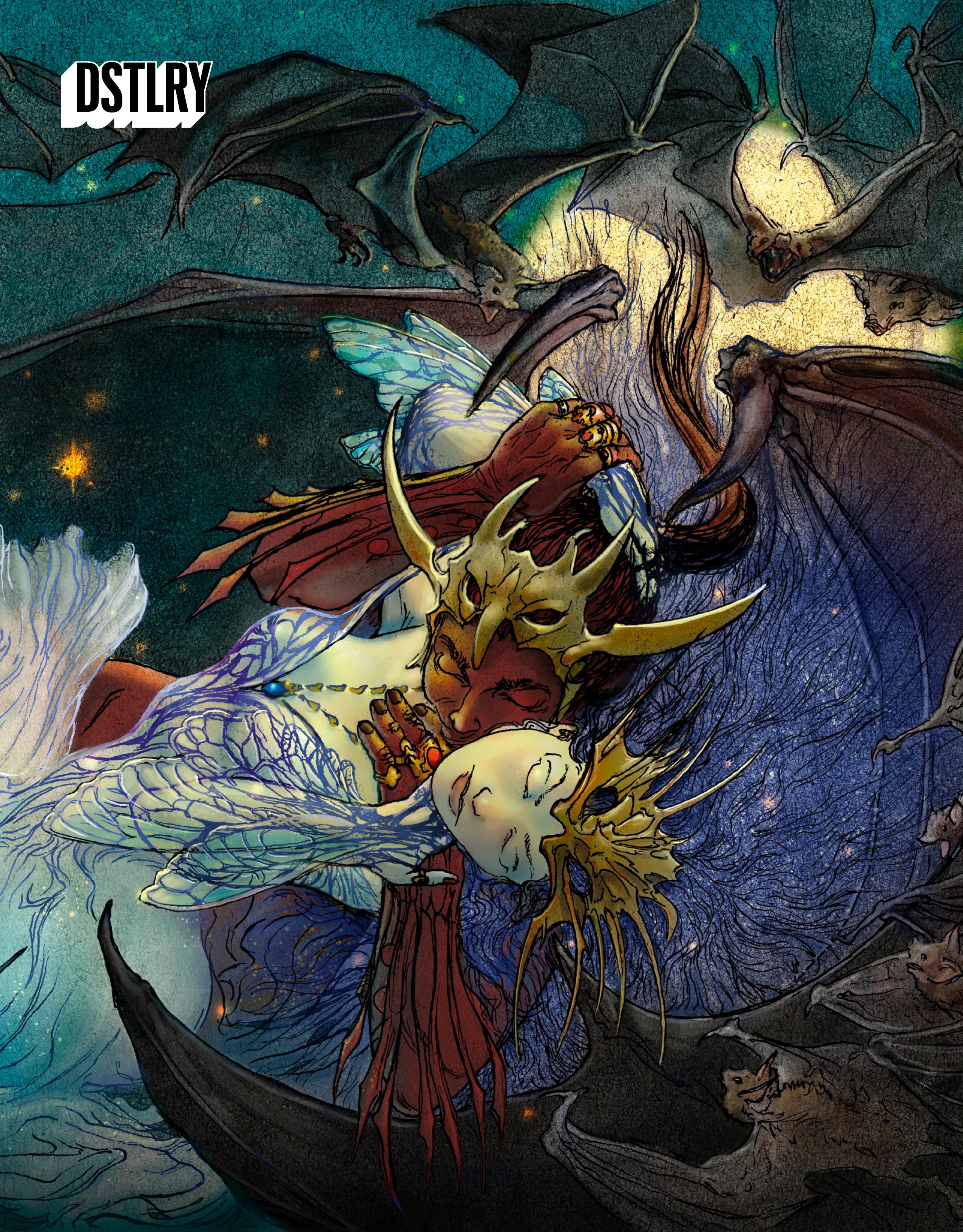
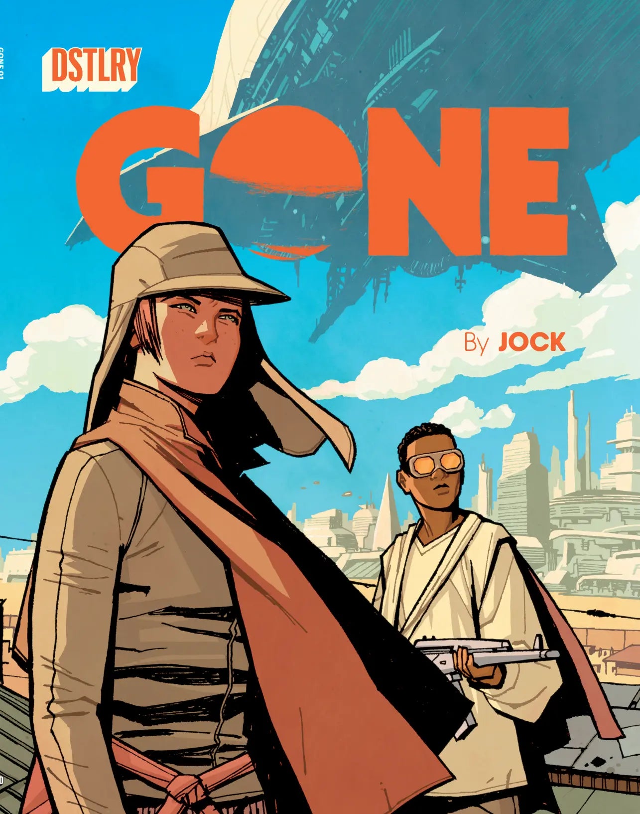
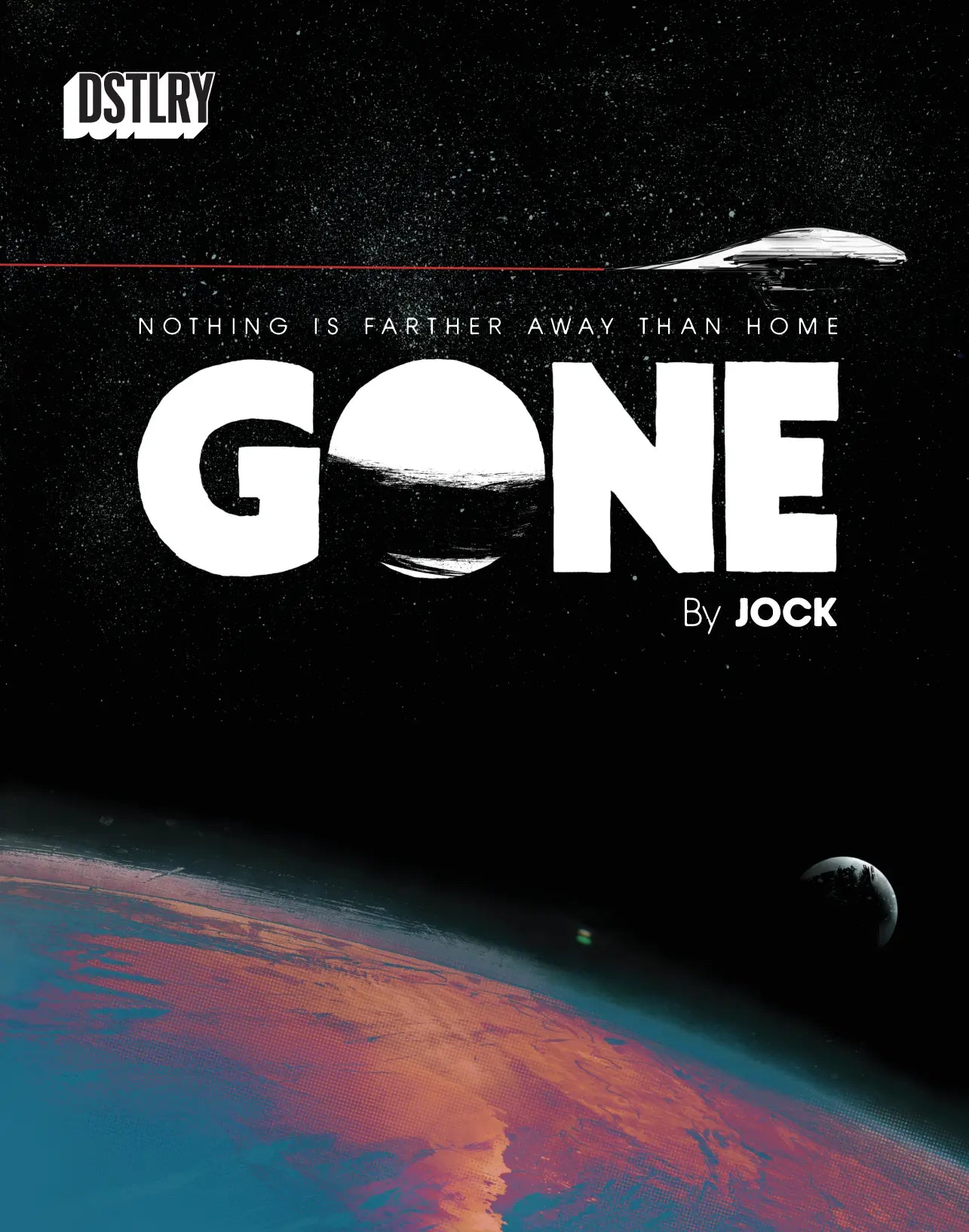
Gone Interior Art by Jock & Lee Loughridge
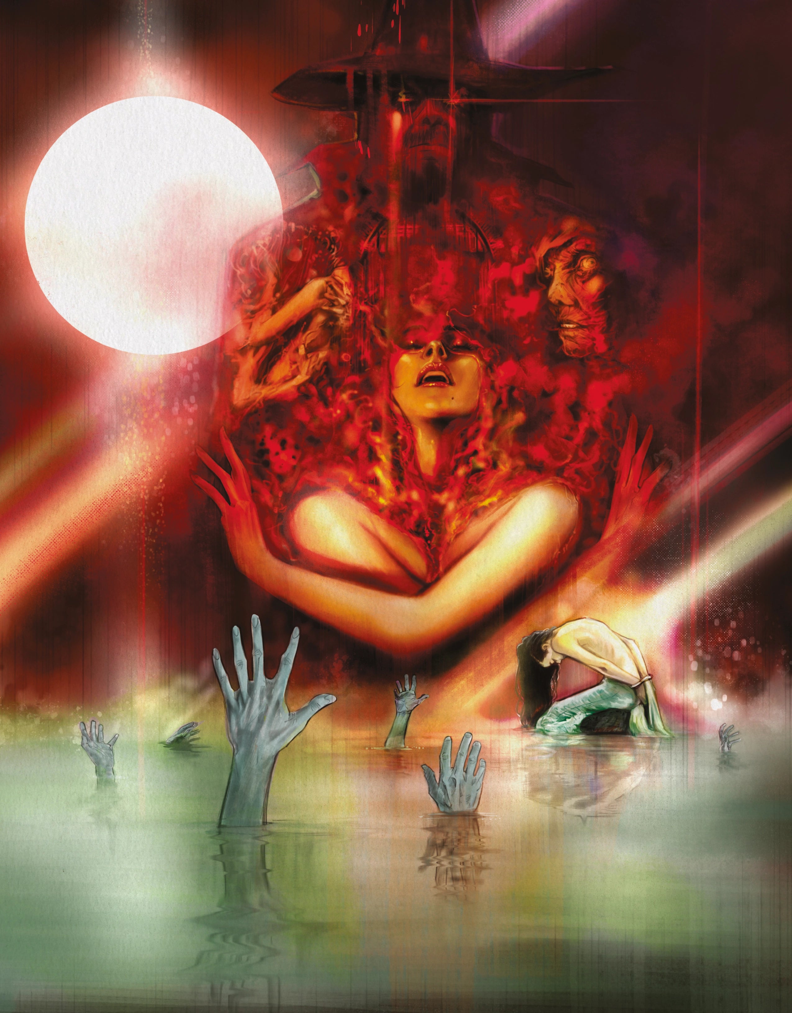
When you're working in horror, like Somna, or science fiction, like Gone, what are some of the big things you keep in mind with your use of color?
I like to keep things simple to build tension and save the splashy color for the big moments.
Both Somna and Gone have Will Dennis as the editor. How was it working with him on both of these projects?
Will is another guy I’ve known for decades, he’s the best. Great kisser.

Congratulations on the 2024 Eisner Award nomination for Best Colorist. Looking at the body of work you were nominated for, how has been building such a robust and varied body of work over the past year, including at DSTLRY?
I’ve worked on a ton of projects over the last year, all very different styles. DSTLRY is definitely the publisher that I can really work in a style I am most comfortable with. It reminds me of the old Vertigo days in a sense.