Cover Artist Marcos Martin on Designing Tension and Mood for Time Waits, The Big Burn, and You Won't Feel a Thing

Marcos Martin has been illustrating incredible comics for decades, often under his pay-what-you-wish Panel Syndicate umbrella. Under this banner, Martin has frequently tagged up with writer Brian K. Vaughan and fellow artist and colorist Muntsa Vicente, shaking the industry with such revolutionary titles as the neo-noir mystery The Private Eye, establishing an incredibly high bar for both digital comics and the widescreen format.

Marcos Martin
This creative team would collaborate once again on the powerful immigration tale Barrier at a time when it was—and remains—an urgent read. Most recently, Martin and Vicente created the visuals for the Eisner- and Harvey-Winning Friday, an occult crime story co-created by Ed Brubaker.
The design-minded unmistakably stylized artist has recently collaborated with DSTLRY on a host of variant covers, including those for The Big Burn #3, You Won't Feel a Thing #1, and Time Waits #3. Writer Ernie Estrella spoke with Martin about drawing these covers and more.
Marcos, walk us through if you could, your three variant covers that you've done with DSTLRY. Take us through briefly what information you were given about each issue, what your approach was on each one, maybe the colors you chose and what story you chose to tell with your cover? First one is Time Waits #3, which is for its final issue.
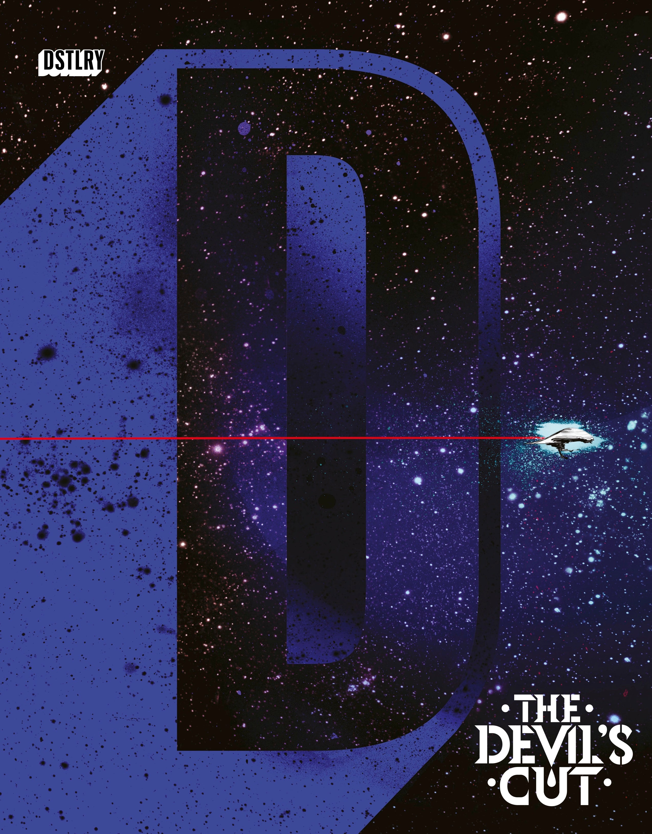
One thing I found interesting about your cover for Time Waits is that most of the story you're telling in your cover is on the back side of the wraparound.
Marcos Martin: Yes, the wraparound cover is a tricky beast, as you want to make the whole image make sense, while at the same time making the front side work within itself with all the other cover design elements (title, credits, publishers bullet, UPC box, etc). In this particular case, as the title was covering most of the top third, I decided to use the main character as the forefront interest point and use the shadows as both a visual metaphor for the watch hands and as direction arrows pointing the reader towards the rest of the information, the different moments in time. I hope the cover has enough elements to pique the readers’ interest and also work from a compositional point of view.
Another cover you finished is for The Big Burn #3, also in its final issue. A detail I enjoyed was the dice the devil throws is always coming up snake eyes. Was that a touch you put in?
Marcos Martin: Yes, my initial idea was to turn the dots into skulls but then I thought the snake eyes would send the same message—that your hand's never going be able to beat the devil no matter what, but in a more subtle way.


The Big Burn #3 Cover E Process by Marcos Martin
Finally, there's your cover for You Won't Feel a Thing #1. This one in particular, the colors you chose tell volumes, could you walk us through coloring this cover?
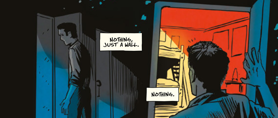
Marcos Martin: Well, the basic idea was to have two layers of color, one brighter for the outside world, the facade, and a darker, more sinister palette for the deeper, traumatic information hidden in the character’s subconscious (what’s behind the door?). Of course, the bright colors would also contrast with the smashed, broken shards of the image (is it a photograph, a mirror?) symbolizing the fragmented nature of his mind going through Alzheimer’s disease. The powerful title just helped bring home the idea.
Finding the right color approach, however, was harder than I imagined since I was thinking at first about regular plain colors for the main layer, with bright blue skies and just different bright color hues for the character. But that wasn’t really working the way I thought it would so I ended up ditching that for a mostly monochrome approach of ocher tones which, while keeping the brighter tone, it also gave out a somewhat sickly feeling.
The red-colored background was an obvious choice and I just decided to reduce the black line of the drawing in order to both keep it on the background and make it a bit more unreal.
You Won't Feel A Thing #1 Cover C Process by Marcos Martin
I typically like to ask artists what they think of all the extra real estate they get to have with the DSTLRY format but I imagine that with all of your work on Barrier and The Private Eye, that you're used to the bigger, European/landscape pages, correct?
Marcos Martin: Fortunately, I’ve been working for years on the widescreen format of my digital comics at Panel Syndicate so this didn’t need much of an adjustment on my part.
After doing these serialized stories, or longer form interior work like Friday, do you like switching to cover work as a palette cleanser?
Marcos Martin: Absolutely. Cover work, although sharing some similarities to interior comic work in that you’re still trying to tell a story visually, requires a different mental approach and set of tools, which I find very liberating. While working on my comic projects I try to fit in cover work every now and then in order to switch off my brain from sequential storytelling. And whenever I finish a long serialized project like Barrier or Friday just recently, I like to spend a few months just working on covers and illustrations before jumping into the interior comic arena again.
How long does it take to finish a cover as opposed to one interior page of art for you?
Marcos Martin: I’d say a cover usually takes me one whole week from coming up with the idea to finishing the final colors, as opposed to a page that might typically take me a couple of days (depending on the page, of course). However, this is not lineal time, by which I mean I might spend days thinking about the cover concept while working on something else.


